Mobile phones are an integral part of everyone’s life. Most people check their mobile phones as soon as they wake up in the morning and probably the last thing before they go to bed at night. Bringing business online will indeed reap substantial business benefits. There are still many businesses with no results even after developing attractive websites.
Why? What could be the possible reason?
Well, It is because they don’t emphasize developing mobile-first website. Instead of choosing desktop-friendly sites, go for mobile-first design first.
The mobile-first design approach practices every kind of digital product from websites to apps.
Mobile-first website development has shown better outcomes and has given better user experience comparatively as mobile phones have become a lifestyle.
According to invisionapp, 85% of adults want better access to the company’s website on mobile phones than its desktop website. As a result, businesses are looking for a mobile-first website development company that can develop a stunning mobile-first website for them.
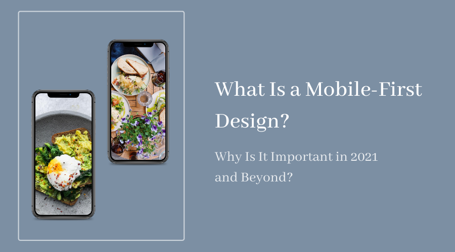
What Is Mobile-First Design?
Mobile-first design is a designing strategy mainly focusing on website development for mobile devices to deliver a better user experience irrespective of any device.
To put it simply, the mobile-first design presents the website information on small screens effortlessly. It is highly recommended as Google gives preference to mobile-first design while indexing.
Shift your current website to a mobile-first site and make users and search engines happier than ever before!
Why Is Mobile-First Design Important for Your Business Success in 2021 and Even Beyond?
It is a win-win situation for you if your web page has a setup with a mobile-first design as it boosts up both the visibility and reachability of your site.
Irrespective of the content, if your website is not mobile-friendly, the results will not be effective. So to rank high, make sure to build your website with a mobile-first design.
7 Reasons Why You Should Adopt Mobile-First Design Approach for Your Business Success in 2021
Content-Focused
In the early development process of the mobile-first design approach, designers take effective content decisions. For example, the hierarchy of the information, content structure, etc., for the limited screen space.
In mobile-first design, contents are concise, clear, and readable. This way, a comprehensive variant of websites gets a clear conception about the product or a brand. Mobile-first design presents accurate information about what a user is looking for on the site.
Small-Screen Friendly
Earlier, people used to view websites on desktops, but now users are most likely to access websites on their smartphones.
The Mobile-first design approach creates user-friendly websites for small screens, focusing on creating more readable content for users who might find it difficult to see the content.
Designers assist the users with limited vision of the site on smartphones, further leading to help other users.
Highly Responsive
The mobile-first design websites are highly responsive, enabling the end-users to access the website smoothly. Highly responsive websites build a better user experience, resulting in an increased number of loyal customers.
The studies observed that 88% of online customers stop visiting the website after experiencing too much loading or buffering in the website.
The mobile-first design approach helps you get traffic to your website, create websites that load instantly, and do not keep the users waiting for too long!
Preferred by Google
As per the recent algorithms, Google is most likely to favor mobile-friendly sites as most people spend their time on mobile phones compared to desktops.
In the last five years, mobile-first design is on the priority list of Google and since then, it has continued with the same.
Google gives preference to mobile-first indexing, and 70% of the websites have already made it their way to mobile-first designs after seeing the exponential usage of mobile phones among all age groups.
Easy Navigation
Users mostly prefer sites with easy access that takes them directly to the page they want to go to without struggling much.
Easy navigation helps the users to explore things on a website seamlessly and gives them a preferable user-experience. Also, mobile-first website navigation makes the users familiar with other important pages.
Increase Visibility and Reach
Optimization of the website for different mobile devices increases visibility and reach. Google always prefers those websites that are quickly accessible on smartphones.
Make your website mobile-friendly to increase the visibility and reach of your website. The site owners need to realize the importance of mobile-first designs, or else their website will not get enough reach on search engines and users.
If a user has a satisfactory experience while exploring your website on a mobile device then there are 100 percent chances of the user to revisit your website.
Increased reach and visibility help achieve good traffic on websites that eventually generates better revenue.
Cost-Effective and Valuable
Money is the first and foremost concern for any business. And that’s where mobile-first design comes into play. The Mobile-first design approach is cost-effective in the long run, generating better profit for various businesses.
Optimized experience strengthens the engagement of people on a website that results in great revenues to the business.
Conclusion
Mobile phones are incredibly handy to use. From booking movie tickets to online shopping and food ordering, people are glued to their mobile phones. This small pocket device has indeed done some wonders.


